Magazyn Inspiracji

Magazyn Inspiracji (Polish for "inspiration depot") is a mobile-first web application made for improvisational theatre actors.
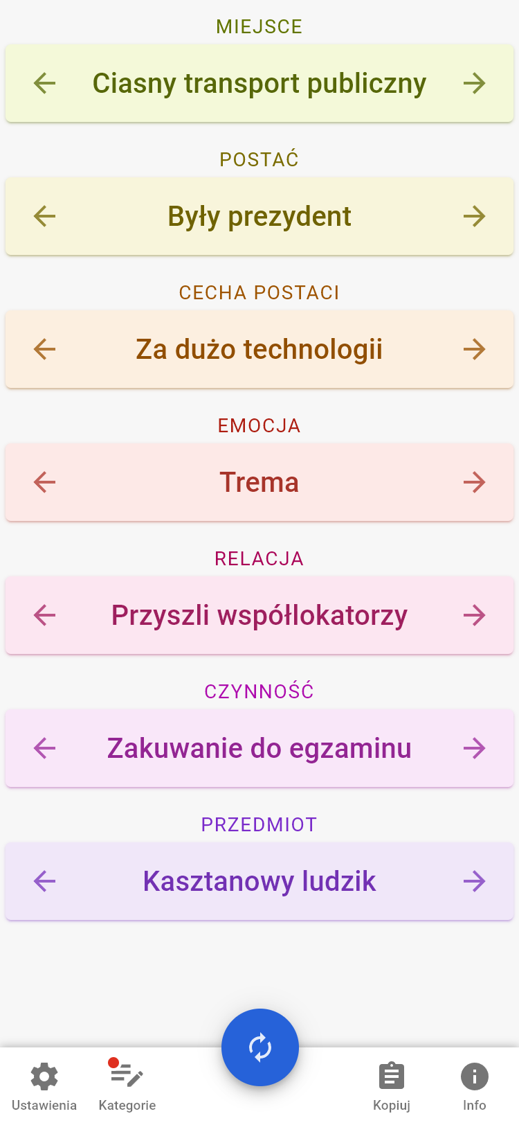
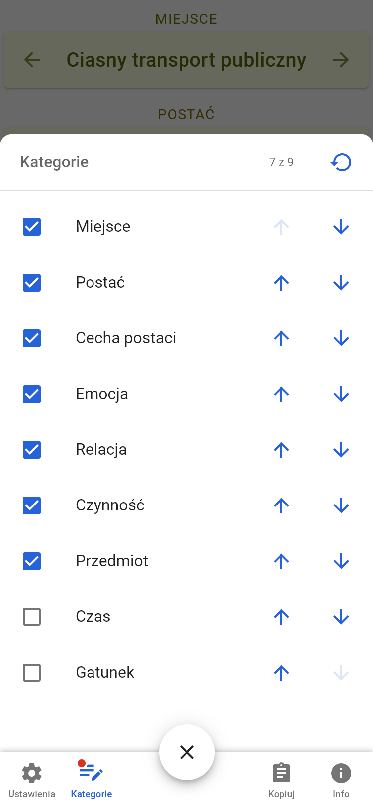
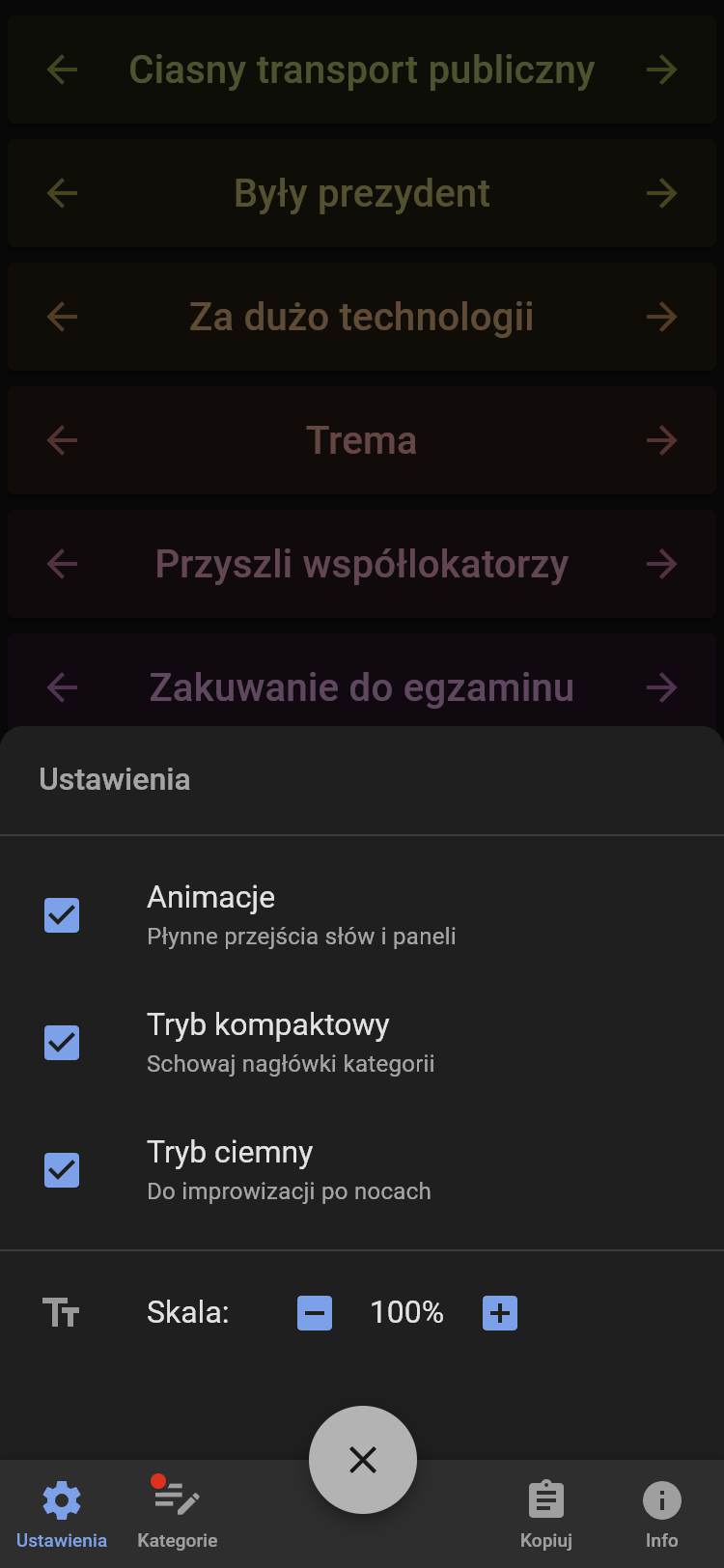
It shows random hand-picked words to be used as scene starters and offers a delightful experience that's been designed and implemented with accessibility as a core feature.
The application is available live at inspirac.je.

  • Time

    • 2018–2025
  • My roles

    • UX/UI Designer
    • Full‑stack Engineer
  • Team

    • Solo project
  • Outcomes

    • Created a one‑stop inspiration source for actors
    • Logged 2000+ unique visitors over the years
    • Reached 3100+ hand‑picked ideas in the database
    • Received very positive response from users

How ideas are born

Missing the inspiration

Humans are most creative under constraints. Improvisational theatre scenes could be about anything, but actors have a hard time coming up with novel ideas when literally everything is possible.

That's why adding constraints, or initial concepts to anchor the scene around, is absolutely essential. When performing for an audience, it's easy to ask them for a few words, but improv groups also need to train in private—with no one to provide that inspiration!

A common workaround is to rely on random passages from books or to name objects lying around—options that are not convenient and usually of very little variance.

Limited external inspiration is even more problematic to solo improvisers, who may end up sticking to repetitive ideas instead of experimenting with new ones.

I've noticed this problem in my own improv group and decided to solve it once and for all, for everyone.

The first attempt

After preparing a modest database of words split into six categories (nouns, places, characters, relations, emotions, any word), I've built a basic website that showed a single word of the category you've clicked on.

While the resulting text was clear, the overall experience of the application was lacking; for improv actors, it would be way more useful to see multiple ideas at once, so they can build a whole scene in one click.

Still, people liked how colorful it looked. This little fact will become important later…

More words at once, please

Taking the initial feedback into account, I've experimented with other layouts and ended up with a vertical list of categories, with Previous/Next buttons next to each entry. And categories formed a colorful vertical gradient!

Many months later, an embarrassing problem surfaced: it looked like I'd designed Magazyn Inspiracji for left-handed users. The majority of people had to uncomfortably reach for the buttons to load new words. That would have been easy to spot if I weren't left-handed…

It was high time to fix this.

Major redesign

In 2021, I've decided to use what I've learned over the years and redesign the application from scratch.

Basing on feedback provided during improv exercises, I've sketched wireframes that focused on the most needed features: jumping to the next word in all categories at once and improving navigation on mobile devices.

I've closely followed Material Design guidelines to implement a card-based layout with a floating action button to advance words in all categories. Discarding the previous color scheme that wasn't compliant with WCAG color contrast guidelines, I've opted for a limited, monochrome palette with a single accent color.

First approach to a full layout.
Too large, too raw.
Compact layout to save space.
Too compact for most.

In the meantime, I've greatly expanded the database by over 70%, increasing the number of entries to 1500+. Noticing how little use is there of some categories, I've put my focus on ones that needed further development, while discarding parts that didn't really inspire anyone.

These decisions were based on feedback from users who said that categories like "totally random dictionary word" provided no value. I couldn't agree more—my improv group also didn't make use of that section.

User feedback

I've ran a few rounds of usability tests with improvisational theatre actors as well as people outside the target group.

Remember that note about people appreciating the colors?

Well, the first set of tests revealed that the application stopped looking inviting, as the lack of colors made it look more like a corporate/pharmacy app with a list of products. Clearly, the spirit of the first version was lost—one tester compared v1 to eating jelly beans, while the v2 appeared broken to her. Muted, corporate colors invoked feelings of being at work instead of creative fun.

Subset of notes compiled during usability testing.

Iterating

Since every tester preferred the compact version, I've focused on improving its look while still giving mobile users an option to further collapse all categories to fit on small screens. Colors from v1 have been brought back, although with improved contrast against the background.

Subsequent feedback rounds led to adjusting the colors and changing chevrons to arrows, so that they aren't mistaken for collapsible accordions. First-time visitors are also prompted to check out the settings menu, which has gotten easier to understand thanks to additional labels.

Finally, I've designed the logo used for application icon, images and descriptions shown when the link is shared on social media.

Before the research: People didn't know what the "Inspire" button would do.
Unclear side buttons.
After feedback: CTA now says it'll show the "next set" of words.
Side buttons got their labels, too.

Results

"It feels like candy"

According to users, the second version of Magazyn Inspiracji is pleasant to interact with, has incredibly useful content—especially for solo improvisers—and is fun to just look at. The new category swipers scroll infinitely in both directions, so both left- and right-handed users can use it comfortably.

Improving the microcopy of the CTA also inspired me to change the icon from generic "forward" arrows to an icon that suggests refreshing or randomization. I made it rotate on click, adding a pleasant microinteraction feedback.

After v2's launch, the community provided lots of great ideas for future improvements, so the project is well alive and will grow substantially when they're implemented.

Colorful categories in full mode.
Managing categories.
Settings in dark theme.

Focus on accessibility

  • Screen readers

    • Magazyn Inspiracji is friendly to visually impaired users that rely on screen readers.
    • All controls are individually labeled, and loading a complete new set of words reads all categories in an ordered manner.
    • I've thoroughly tested the website with NVDA Screen Reader.
    • Windows's high-contrast mode is also covered by dedicated styles.
  • Respecting preferences

    • Each visitor's browsing preferences are detected and applied on first visit, but users can override them at any time.
    • I've made sure to include a variant without animations for people sensitive to motion, and a dark theme for use in low-light conditions, like on a dimly lit scene.
  • Convenient navigation

    • Every element can be interacted with via mouse, touch or keyboard.
    • The most useful element—the forward-all button—is placed at the bottom, making it easily reachable on mobile devices.
    • Focus styles are more visible when using a keyboard, and they don't interfere with other input methods.

Outcomes

The new version made in 2021 has received universal praise, mainly due to rich content, ease of navigation, useful options and delightful visual design with fun animations.

Over the years, I've built the words database from scratch to 900+, then to over 3000 hand-picked entries. New features, words and categories are still being added based on the improv community's feedback.

While the project was made with improvisational theatre in mind, it can be easily adapted to act as a randomizer/generator for any other purpose: character builder for role-playing games, name generator for new parents, base for charades, writing prompts, etc. Being open source, anyone can fork the project and build upon it.

I've learned that following a design system too tightly can yield unwanted results, like making the application look too serious/corporate as opposed to friendly. Daring to explore around has added a personal flavor that made the experience more memorable and pleasant.

The application is available live at inspirac.je, on a so-called domain hack that spells out the Polish word for inspirations.