MALgraph

MALgraph is an open source web application working in tandem with a user's profile on MyAnimeList (MAL)—a website for creating lists of animated Japanese shows/movies or completed comics and light novels.
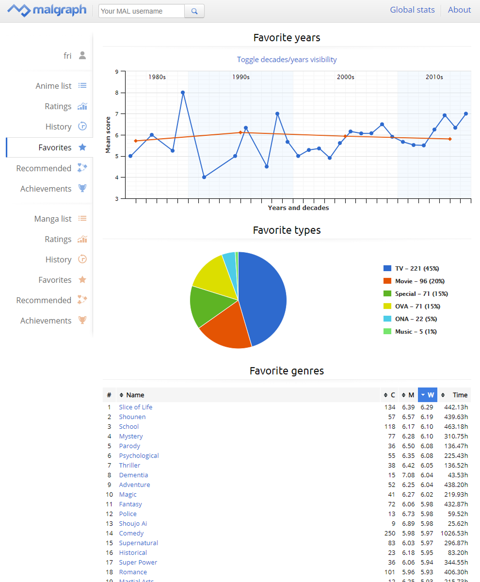
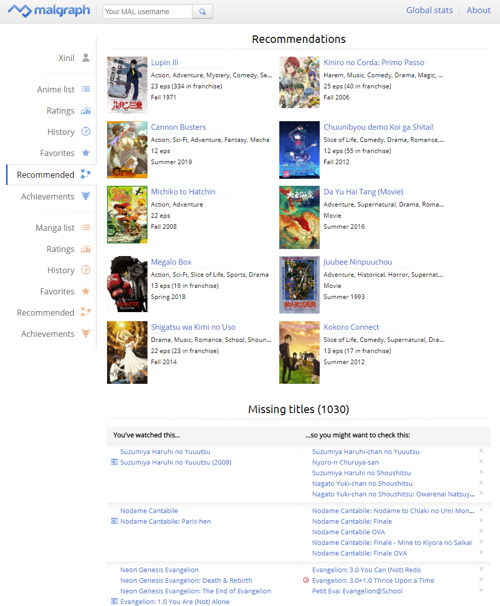
Once one's MAL username is entered, MALgraph shows detailed analysis, statistics and recommendations based on the specified user's anime and manga data.

  • Time

    • 2011–2015
  • My roles

    • UX/UI Designer
    • Community Manager
  • Team

    • Me as a designer
    • 1 full-stack developer
  • Outcomes

    • Exceeded 200 000 unique users
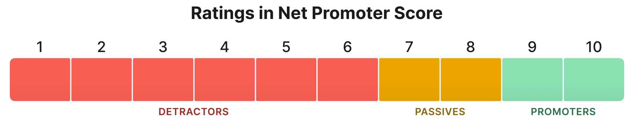
    • Impacted the users to use the 10/10 rating less often
    • Designed new monetization paths for the parent website
    • Got 159 stars and 37 forks on GitHub
    • Built a strong community eager to help

How it all began

The problem

When was the last time you rated something "3 out of 10"?

On a 1–10 scale, people tend to give very high ratings to mediocre shows, sometimes not even using the bottom half of the scale. As a result, average scores are noticeably shifted towards the higher end of the spectrum.

Comparison of rating scales: classic versus modern.

While I appreciate that there may be solid reasons for this—e.g., someone disliked a show so much that they stopped watching it without giving it a rating, so the only times they submit any number is after it was good enough to care—there's no doubt that this rating inflation makes public scores difficult to interpret.

It doesn't help that Net Promoter Score's classification of responses also treats 9–10 as the only positive ones.

Net Promoter Score only considers 9 and 10 to be positive.

One of the services affected by this phenomenon is MyAnimeList, which allows its users organize their anime and manga titles and rate each entry on a 1–10 scale.

In a perfect Gaussian distribution, scores in this range should yield a mean of 5.5. Should. But they didn't. And in my eyes that was a problem, so I felt the need to do something about it.

Humble beginnings

Noticing an inflated average—a lot of mediocre shows being rated 7 or higher—I've decided to fetch the scores from my own MyAnimeList profile and present them in a graph form.

The very first MALgraph version only showed one's anime rating distribution chart and notified the user if they've given an unusually high number of 10/10 ratings. The minimal feel of the application emphasized its focus on showing just that—a barebones bar chart.

Although it wasn't meant to be anything more than a personal one-off project at first, this idea quickly caught on with the MyAnimeList community. People started screenshotting their graphs to put them in their profiles, so that others could see their statistics.

Organic growth

Seeing how eager users are to share their superior anime rating graphs, I've added a similar chart for manga and collected all users' data in a global stats summary, so everyone could compare their averages to others.

To satisfy MyAnimeList users' needs, a share function was implemented, so one could copy and paste a bar chart to their profile, complete with a link back to MALgraph.

By creating a public forum on MAL, I was able to distill user feedback to actionable points and prepare mockups for the other developer—my lifelong friend—who joined me in this pursuit.

Feedback loop

As the team grew to 2 people, the project was finally able to reach new heights. I've designed all subsequent versions in Adobe Photoshop, focusing on keeping the page easy to scan with all the newly introduced statistics.

The increased popularity shaped some design decisions, e.g. the profile's layout had to incorporate a refresh button, since automatic refreshes would exceed MAL's daily quota limits. Users could also compare stats with other people.

The 3rd version of MALgraph let you compare stats of two users.

During the development, I privately asked multiple users for feedback on conflicting approaches to some parts of the website. Their answers would shape the formulas used in the backend, thus impacting how the application works.

Stabilization

With the final—4th—version, I've modernized the application's look, including subtle touches that improved interactivity. Emphasizing content over geeky info bubbles streamlined the design, making it consistent and easier to use.

I've written multiple variants of microcopy shown next to the loading spinner, entertaining the user with silly progress texts like "Proving P=NP…" and "antialiasing buttons", while they wait for some process to finish.

Working with the community, I've been maintaining the database, introducing new achievements and discussing potential new features. I made sure to keep the relevant documentation up-to-date for future maintainers.

Results

The 4th version of MALgraph.
Shows the profile, various stats, and interactions to dive deeper into your own data.
Statistics such as "Favorite years" or "Genres" helped reveal trends and biases you weren't aware of.
People found the "Missing titles" feature especially useful to watch specials of their favorite shows.

Details worth mentioning

  • Interactions

    • Each chart and any blue data point can be clicked to reveal more information.
    • Users could see the complete list of 80s titles they completed or recall what manga deserved a 9/10 rating in their eyes.
  • Admin panel

    • Downloading the database part by part meant having to work with data that's often outdated or corrupted.
    • An admin panel was designed to aid the owners in managing the manga, anime, and user cache.
    • This greatly shortened our reaction time to outages.
  • Achievements

    • Being a major incentive to share your own MALgraph link to brag to others, achievements became a significant part of the application.
    • I've designed all badges and their playful descriptions to hook users into re-visiting the page often.
    • It worked exceptionally well. Many people only cared about the achievements!
  • Privacy

    • User's choice of list privacy on MAL is respected, so even if their overall stats are shown, lists' contents can be hidden.
    • Each user can request the admins to block their profile from being displayed in MALgraph, no questions asked.

Outcomes

Over 200 000 unique MyAnimeList users' statistics have been tracked.

The global average shifted from 6.95 to 6.52 over the years. A noticeable trend was people re-rating entries on their lists, using the whole 1–10 scale.

I was asked by MyAnimeList's admins to help redesign its user profiles.
Since so many users have shown interest in statistics, the redesign included a clean look at basic stats and better use of available space without sacrificing information.
That redesign opened a new monetization option to site owners: stats' color customization for paying members.

After the original instance was closed in June 2015, MALgraph's legacy continues to live on under a different maintainer, with unchanged design.

I've learned that a seemingly niche product can capture hearts of thousands. Exploring a wild idea might fill a void that nobody had noticed before, and investing time in the unknown may be worth it.

We got invited to a closed group for third-party developers that use MyAnimeList data. We've given feedback how to improve developer experience, and, in turn, increase the value of the main site by allowing it to expand beyond the original vision.

Some of my ideas for MyAnimeList's redesign.
MyAnimeList's paid features include customizing the new elements I designed for them.

Would I do anything differently today?

Absolutely, yes.

I would start with a mobile-first design. At that time it wasn't the standard, and it shows—the page hardly fits on a narrow screen.

I would think twice about building a product that heavily relies on third-party data without proper API access. Despite frequent communication with MyAnimeList staff, we still got rate-limited every few days.

I would offload the work on achievements to the community. We had a very strong community with over 2000 fans, eager to help and suggest more badges and categories.

After reading Practical Charts by Nick Desbarats, I see how much MALgraph's data visualizations could be improved. We should have treated missing data points differently, and the charts' design could be more readable as well.